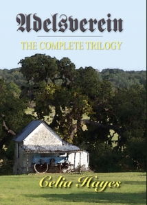
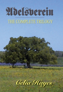
All right – my publisher and I have decided to bring out a hard-bound copy of the Adelsverein Trilogy, all three volumes in one handy and perhaps rather cheaper yet more durable format. There are two versions of the dust-jacket being suggested: which do you think is more attractive on the shelf, keeping in mind, of course, that we cannot afford original art — because otherwise I would so hire someone like Don Troiani.
Which of these works better — version one, using a picture taken on the grounds of old Fort Martin Scott…
Or version two … which continues the South Texas landscape motif of the single -volume covers?
I can’t make up my mind, really — which is why I am throwing it out there. Your preferences and feedback are welcome.


The first one seems to have a stronger focal point. As much as I like the type face for the title, I think it will cause problems: (a) people won’t know whether the first letter is A or U; (b) others will think the book is written in German. Just a thought. . .
The fraktur typeface is the same as we’ve used on the three individual books of the Trilogy, and it hasn’t been a problem so far … heck I’d love to actually have the Trilogy available in German translation, I would so clean up from all the Karl May fans…
I happen to like the second dust jacket better, but I agree with knightofswords about the typeface.
I prefer the first picture and must admit I didn’t notice the possibility of the title font being confusing until it was pointed out. The first letter certainly could be mistaken…
I’m more drawn to the picture with the barn.